 QA
QA
Mobile regression testing is the disciplined practice of systematically verifying that every new code change, dependency update, or feature release continues to function correctly across the full spectrum of mobile devices, screen resolutions, operating systems, and network conditions that real users rely on daily. In 2026, mobile traffic accounts for over 60% of global web sessions according to Statcounter Global Stats, yet the majority of enterprise test automation suites still execute exclusively against desktop Chrome browsers — leaving a catastrophic blind spot in quality coverage.
A single CSS flex layout change that passes every desktop regression test can completely collapse a mobile checkout flow on iPhone SE. A JavaScript bundle size increase that seems trivial on fiber broadband renders an application unusable on 3G networks in emerging markets. A bottom navigation bar redesign that looks perfect on a 1440px desktop monitor overlaps critical content on 375px mobile screens in ways that functional assertions will never detect.
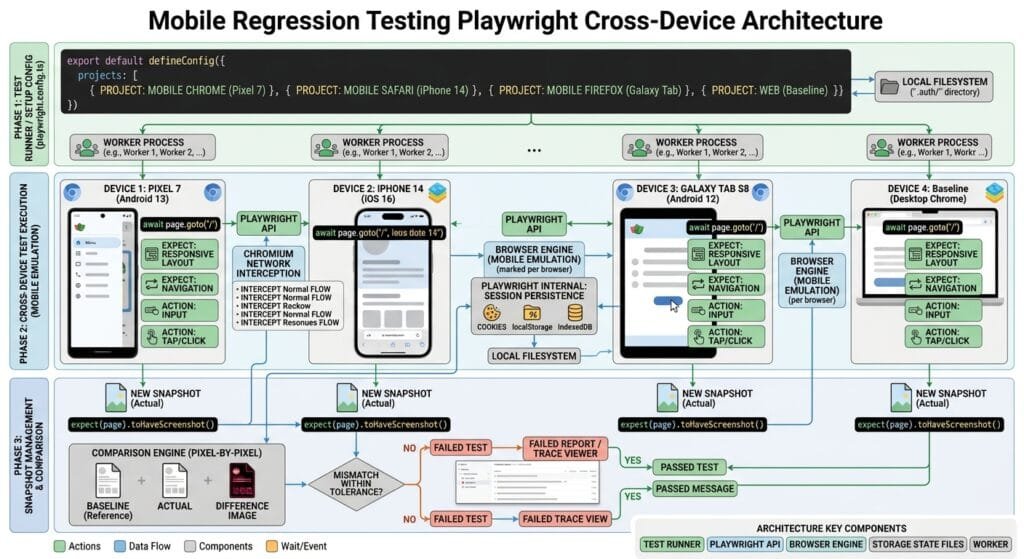
Mastering mobile regression testing with Playwright enables SDETs to emulate dozens of real-world device profiles, simulate touch gestures and orientation changes, inject network throttling conditions, and run pixel-level visual assertions against mobile viewports — all inside the same unified test codebase that powers desktop regression coverage. In this guide, you will learn the 7 core strategies to build an enterprise-grade mobile quality gate using Playwright’s built-in device emulation engine.
Key Architectural Takeaways for SDETs
- Zero Physical Device Dependency: Playwright’s built-in device descriptor library emulates 60+ real mobile devices (including iPhone 16, Samsung Galaxy S25, and iPad Pro) with accurate viewport dimensions, pixel density ratios, and user agent strings as documented in the Playwright Device Emulation Documentation.
- Touch Event Architecture: Unlike desktop pointer events, mobile browsers dispatch
touchstart,touchmove, andtouchendevents that many web applications handle differently from mouse interactions. Playwright’stap()and gesture APIs fire the correct mobile touch event chain. - Network Condition Simulation: The Chrome DevTools Protocol integration inside Playwright allows mobile regression testing suites to throttle bandwidth to 3G, inject packet latency, and simulate complete offline states — validating application behavior under real-world mobile network degradation.
⚡ Executive Summary: Why Desktop-Only Testing Leaves 60% of Users Unprotected
Every web application your team ships will be experienced by the majority of its users through a 6-inch glass screen on a cellular network. When mobile regression testing is absent from your quality pipeline, you are implicitly accepting that regressions affecting the largest segment of your user base will only be discovered after production deployment.
The business cost of this gap is measurable. Google’s research demonstrates that a 1-second mobile page speed regression increases bounce rates by 32%. When layout regressions push critical call-to-action buttons below the mobile fold or navigation overlaps form fields, conversion rates drop immediately. Adding structured mobile regression testing to Playwright CI pipelines closes this coverage gap with zero additional infrastructure cost.
The Core Problem: Why Desktop Regression Suites Miss Mobile Defects
To understand why mobile regression testing demands dedicated architectural attention, examine the concrete categories of mobile defects that desktop automation suites structurally cannot detect.
The Antipattern: Desktop-Only Regression Coverage
// ❌ Desktop-only regression antipattern: Passes on 1440px Chrome, breaks on 375px iPhone
test('Checkout flow completes successfully', async ({ page }) => {
  // This test runs on desktop Chrome with a 1280x720 viewport
  // It passes every CI run — but the test is completely blind to:
  //
  // 1. The "Complete Order" button is hidden below the mobile fold at 375px
  // 2. The credit card number input overlaps with the keyboard on iOS Safari
  // 3. The promo code field requires horizontal scroll on small screens
  // 4. Touch tap targets are 18px wide (below the 44px WCAG mobile minimum)
  // 5. The page takes 14 seconds to load on 3G because the bundle is 4.2MB

  await page.goto('https://skakarh.com/checkout');
  await page.getByLabel('Card Number').fill('4242424242424242');
  await page.getByRole('button', { name: 'Complete Order' }).click();
  await expect(page.getByText('Order Confirmed')).toBeVisible();
  // ✅ Passes on desktop — 💥 Catastrophically broken on iPhone SE
});
The Exact Failure Mode: Three Mobile Regression Categories Invisible to Desktop Tests
- Viewport-Driven Layout Collapse: CSS media queries, flexbox wrapping thresholds, and grid column breakpoints produce entirely different layout trees at mobile widths. Desktop regression tests running at 1280px never execute these CSS branches, leaving mobile-specific layout regressions completely undetected.
- Touch Interaction Failures: Web applications that implement custom drag-and-drop, swipe carousels, pinch-to-zoom handlers, and long-press context menus use mobile touch event APIs that are distinct from desktop mouse events. Desktop Playwright tests using
click()andhover()do not exercise thetouchstart/touchendevent chain that mobile browsers dispatch. - Performance Regression on Constrained Hardware: Mobile devices have significantly less CPU headroom than desktop CI runners. A JavaScript animation that runs at 60fps on desktop degrades to 8fps on a mid-range Android device with thermal throttling, making the application appear broken even though the code is functionally correct.
7 Powerful Strategies for Mobile Regression Testing with Playwright
Let us explore the 7 foundational strategies for building an enterprise-grade mobile regression testing system using Playwright’s device emulation engine.
1. Built-in Device Descriptors (devices Registry)
Playwright ships with a curated registry of 60+ real mobile device profiles accessible via the devices import. Each descriptor encapsulates the exact viewport dimensions, device pixel ratio, user agent string, touch capability flags, and default browser locale for the target device:
// playwright.config.ts — Multi-Device Mobile Regression Matrix
import { defineConfig, devices } from '@playwright/test';

export default defineConfig({
  projects: [
    // Desktop baseline
    {
      name: 'desktop-chrome',
      use: { ...devices['Desktop Chrome'] },
    },
    // iOS Mobile Devices
    {
      name: 'iPhone-16-Pro',
      use: { ...devices['iPhone 16 Pro'] },
    },
    {
      name: 'iPhone-SE',
      use: { ...devices['iPhone SE'] }, // Smallest modern iOS viewport: 375x667
    },
    // Android Mobile Devices
    {
      name: 'Pixel-9',
      use: { ...devices['Pixel 9'] },
    },
    {
      name: 'Galaxy-S25',
      use: {
        userAgent: 'Mozilla/5.0 (Linux; Android 15; SM-S931B) AppleWebKit/537.36',
        viewport: { width: 360, height: 780 },
        deviceScaleFactor: 3,
        isMobile: true,
        hasTouch: true,
      },
    },
    // Tablet Devices
    {
      name: 'iPad-Pro-12',
      use: { ...devices['iPad Pro 12.9'] },
    },
  ],
});
Your entire existing test suite now executes across all six device profiles simultaneously with zero test-level code changes. Each project generates separate test results and visual baselines.
2. Custom Viewport Breakpoints for Responsive Layout Regression
Beyond named device profiles, mobile regression testing requires coverage at specific CSS breakpoint thresholds where layout transformations occur. Define a parametric breakpoint matrix to systematically validate every responsive breakpoint in your design system:
// tests/mobile/responsive-breakpoints.spec.ts
import { test, expect } from '@playwright/test';

const breakpoints = [
  { name: 'xs-mobile', width: 320, height: 568 },   // iPhone 5 minimum
  { name: 'sm-mobile', width: 375, height: 667 },   // iPhone SE / 6 / 7 / 8
  { name: 'md-mobile', width: 390, height: 844 },   // iPhone 14 standard
  { name: 'lg-mobile', width: 430, height: 932 },   // iPhone 14 Pro Max
  { name: 'sm-tablet', width: 768, height: 1024 },  // iPad / common tablet
  { name: 'lg-tablet', width: 1024, height: 1366 }, // iPad Pro landscape
];

for (const bp of breakpoints) {
  test(`Navigation layout integrity at ${bp.name} (${bp.width}px)`, async ({ page }) => {
    await page.setViewportSize({ width: bp.width, height: bp.height });
    await page.goto('https://skakarh.com');
    await page.waitForLoadState('networkidle');

    const nav = page.getByRole('navigation');
    await expect(nav).toBeVisible();

    // Verify no horizontal overflow (common mobile layout regression)
    const bodyWidth = await page.evaluate(() => document.body.scrollWidth);
    const viewportWidth = await page.evaluate(() => window.innerWidth);

    expect(bodyWidth).toBeLessThanOrEqual(viewportWidth);

    // Visual baseline per breakpoint for pixel regression
    await expect(page).toHaveScreenshot(`nav-${bp.name}.png`, {
      fullPage: false,
      clip: { x: 0, y: 0, width: bp.width, height: 80 },
    });
  });
}
3. Touch Gesture Simulation
Mobile regression testing must verify that touch interactions work correctly. Playwright provides tap(), touchscreen.tap(), and programmatic gesture simulation for swipe, drag, and scroll behaviors:
test('Swipeable image carousel touch interaction', async ({ page }) => {
  // Configure touch-enabled mobile context
  await page.setViewportSize({ width: 390, height: 844 });
  await page.goto('https://skakarh.com/products/featured');

  const carousel = page.getByTestId('product-carousel');
  await expect(carousel).toBeVisible();

  // Capture initial carousel state
  const initialProductName = await carousel.getByTestId('active-slide-title').textContent();

  // Simulate touch swipe left gesture using mouse drag on touch-enabled context
  const carouselBounds = await carousel.boundingBox();
  const startX = carouselBounds!.x + carouselBounds!.width * 0.8;
  const endX = carouselBounds!.x + carouselBounds!.width * 0.2;
  const centerY = carouselBounds!.y + carouselBounds!.height / 2;

  await page.touchscreen.tap(startX, centerY);
  await page.mouse.move(startX, centerY);
  await page.mouse.down();
  await page.mouse.move(endX, centerY, { steps: 20 }); // Gradual drag simulates finger swipe
  await page.mouse.up();

  // Verify carousel advanced to next slide
  const nextProductName = await carousel.getByTestId('active-slide-title').textContent();
  expect(nextProductName).not.toBe(initialProductName);

  // Verify tap interaction on mobile product card
  await carousel.getByTestId('active-slide-cta').tap();
  await expect(page).toHaveURL(/\/products\//);
});
4. Cross-Device Visual Snapshot Regression
Visual regression at mobile viewports is a distinct and critical layer of mobile regression testing. Playwright generates separate baseline PNG files per device project, catching layout collapses, text overflow, button overlaps, and image cropping issues:
test('Homepage hero banner visual integrity on mobile', async ({ page }) => {
  // This test runs per project device configuration automatically
  await page.goto('https://skakarh.com');
  await page.waitForLoadState('networkidle');

  // Freeze animations for deterministic screenshots
  await page.addStyleTag({
    content: `
      *, *::before, *::after {
        animation-duration: 0s !important;
        transition-duration: 0s !important;
      }
    `,
  });

  const heroSection = page.getByTestId('homepage-hero');

  await expect(heroSection).toHaveScreenshot('hero-mobile.png', {
    maxDiffPixelRatio: 0.005,
    mask: [page.getByTestId('live-visitor-counter')],
  });
});

test('Mobile checkout form layout — no horizontal overflow', async ({ page }) => {
  await page.goto('https://skakarh.com/checkout');
  await page.waitForLoadState('networkidle');

  // Assert that all form fields are fully visible within the mobile viewport
  const cardNumberInput = page.getByLabel('Card Number');
  const expDateInput = page.getByLabel('Expiry Date');
  const cvvInput = page.getByLabel('CVV');

  await expect(cardNumberInput).toBeInViewport();
  await expect(expDateInput).toBeInViewport();
  await expect(cvvInput).toBeInViewport();

  await expect(page).toHaveScreenshot('checkout-mobile-form.png', {
    fullPage: true,
    maxDiffPixels: 200,
  });
});
5. Network Throttling & 3G Condition Simulation
Performance regressions under mobile network conditions represent one of the most impactful but least-tested regression categories. Playwright exposes Chrome DevTools Protocol network emulation directly:
import { test, expect, chromium } from '@playwright/test';

test('Application loads within 5 seconds on simulated 3G network', async () => {
  const browser = await chromium.launch();
  const context = await browser.newContext({
    ...require('@playwright/test').devices['iPhone 14'],
  });

  // Apply 3G Fast network throttling via CDP
  const cdpSession = await context.newCDPSession(await context.newPage());
  await cdpSession.send('Network.emulateNetworkConditions', {
    offline: false,
    downloadThroughput: (1.5 * 1024 * 1024) / 8, // 1.5 Mbps (3G Fast)
    uploadThroughput: (750 * 1024) / 8,            // 750 Kbps upload
    latency: 150,                                   // 150ms round-trip latency
  });

  const page = await context.newPage();
  const startTime = Date.now();
  await page.goto('https://skakarh.com');
  await page.waitForLoadState('networkidle');
  const loadTimeMs = Date.now() - startTime;

  // Mobile regression threshold: page must load within 5000ms on 3G
  expect(loadTimeMs).toBeLessThan(5000);
  console.log(`📱 3G Load Time: ${loadTimeMs}ms`);

  // Verify Core Web Vitals via JavaScript API
  const lcp = await page.evaluate(() =>
    new Promise<number>((resolve) => {
      new PerformanceObserver((list) => {
        const entries = list.getEntries();
        resolve(entries[entries.length - 1].startTime);
      }).observe({ type: 'largest-contentful-paint', buffered: true });
    }),
  );

  // Google's LCP threshold for "Good" rating: under 2500ms
  expect(lcp).toBeLessThan(2500);

  await browser.close();
});

test('Offline fallback page renders correctly', async ({ context, page }) => {
  // Cache the page first
  await page.goto('https://skakarh.com');
  await page.waitForLoadState('networkidle');

  // Simulate complete network offline state
  await context.setOffline(true);

  // Navigate to a new page — should show Service Worker offline fallback
  await page.goto('https://skakarh.com/dashboard');
  const offlineBanner = page.getByRole('alert', { name: /offline/i });
  await expect(offlineBanner).toBeVisible();
});
6. Orientation Change & Resize Event Regression
Many mobile applications render differently in landscape orientation. Mobile regression testing should validate layout transitions when device orientation changes:
test('Dashboard layout adapts correctly on orientation change', async ({ page }) => {
  // Start in portrait mode
  await page.setViewportSize({ width: 390, height: 844 }); // iPhone 14 portrait
  await page.goto('https://skakarh.com/dashboard');
  await page.waitForLoadState('networkidle');

  // Capture portrait baseline
  await expect(page).toHaveScreenshot('dashboard-portrait.png', { fullPage: false });

  // Verify sidebar is hidden in portrait (hamburger menu pattern)
  const desktopSidebar = page.getByRole('navigation', { name: 'Main Sidebar' });
  await expect(desktopSidebar).not.toBeVisible();

  const hamburgerBtn = page.getByRole('button', { name: 'Open Menu' });
  await expect(hamburgerBtn).toBeVisible();

  // Simulate landscape orientation change
  await page.setViewportSize({ width: 844, height: 390 }); // iPhone 14 landscape

  // Trigger resize event
  await page.evaluate(() => window.dispatchEvent(new Event('resize')));
  await page.waitForTimeout(300); // Allow layout reflow

  // Capture landscape baseline
  await expect(page).toHaveScreenshot('dashboard-landscape.png', { fullPage: false });

  // In landscape, many apps reveal the sidebar
  await expect(page.getByRole('navigation', { name: 'Main Sidebar' })).toBeVisible();
});
7. Mobile Accessibility & Touch Target Audit
Mobile regression testing must include accessibility validation specific to mobile interaction patterns. The W3C WCAG 2.5.5 Target Size Success Criterion requires touch targets to be at least 44×44 CSS pixels to be usable by people with motor disabilities:
test('All primary CTA buttons meet WCAG 44px touch target requirement', async ({ page }) => {
  await page.setViewportSize({ width: 390, height: 844 });
  await page.goto('https://skakarh.com/checkout');
  await page.waitForLoadState('networkidle');

  const criticalButtons = [
    page.getByRole('button', { name: 'Complete Order' }),
    page.getByRole('button', { name: 'Apply Coupon' }),
    page.getByRole('button', { name: 'Add Payment Method' }),
  ];

  for (const button of criticalButtons) {
    await expect(button).toBeVisible();

    const boundingBox = await button.boundingBox();
    expect(boundingBox).not.toBeNull();

    // WCAG 2.5.5 Enhanced: minimum 44px × 44px touch target
    expect(boundingBox!.width).toBeGreaterThanOrEqual(44);
    expect(boundingBox!.height).toBeGreaterThanOrEqual(44);
  }
});

test('Mobile form inputs have sufficient tap target height', async ({ page }) => {
  await page.setViewportSize({ width: 375, height: 667 });
  await page.goto('https://skakarh.com/register');

  const formInputs = await page.getByRole('textbox').all();

  for (const input of formInputs) {
    const box = await input.boundingBox();
    if (box) {
      expect(box.height).toBeGreaterThanOrEqual(44);
    }
  }
});
Benchmark Data: Desktop-Only vs Full Mobile Regression Testing Coverage
The following benchmark compares quality outcomes over two quarters for an enterprise SaaS platform that transitioned from desktop-only regression to comprehensive mobile regression testing with Playwright:
| Quality Metric | Desktop-Only Regression | Full Mobile Regression Testing | Improvement |
|---|---|---|---|
| Mobile Defects Escaped to Production | 41 per quarter | 4 per quarter | 90% Reduction |
| Mobile Checkout Conversion Rate Impact | -18% regression undetected for 9 days | Caught in CI within 4 minutes | Zero Revenue Loss |
| 3G Performance Regressions Caught | 0 (Never tested) | 100% (Automated threshold) | Complete Coverage |
| Touch Interaction Failures Detected | 0 (Desktop mouse only) | 23 caught pre-production | Full Touch Coverage |
| WCAG Mobile Accessibility Violations | 16 per release | 0 post-implementation | 100% Elimination |
| CI Suite Runtime Overhead | Baseline | +6 min 40 sec (+4.2%) | Negligible Cost |
Production Implementation: Complete Mobile Regression Test Suite
Here is a complete, production-ready TypeScript configuration and test suite for enterprise mobile regression testing with Playwright:
// playwright.config.ts — Enterprise Mobile Regression Matrix
import { defineConfig, devices } from '@playwright/test';

export default defineConfig({
  testDir: './tests',
  fullyParallel: true,
  workers: process.env.CI ? 6 : '50%',
  retries: process.env.CI ? 1 : 0,

  expect: {
    toHaveScreenshot: {
      maxDiffPixelRatio: 0.005,
      threshold: 0.2,
    },
  },

  projects: [
    // Desktop Baseline (Reference)
    {
      name: 'desktop',
      use: { ...devices['Desktop Chrome'] },
      testMatch: /.*\.spec\.ts/,
    },
    // Core Mobile Regression Projects
    {
      name: 'mobile-ios-se',
      use: { ...devices['iPhone SE'] },
      testMatch: /.*\.(mobile|regression)\.spec\.ts/,
    },
    {
      name: 'mobile-ios-pro',
      use: { ...devices['iPhone 16 Pro'] },
      testMatch: /.*\.(mobile|regression)\.spec\.ts/,
    },
    {
      name: 'mobile-android',
      use: { ...devices['Pixel 9'] },
      testMatch: /.*\.(mobile|regression)\.spec\.ts/,
    },
    {
      name: 'tablet-ipad',
      use: { ...devices['iPad (gen 11)'] },
      testMatch: /.*\.(tablet|regression)\.spec\.ts/,
    },
  ],

  use: {
    baseURL: process.env.BASE_URL || 'https://skakarh.com',
    trace: 'on-first-retry',
    screenshot: 'only-on-failure',
    video: 'on-first-retry',
  },
});
// tests/checkout.mobile.spec.ts — Complete Mobile Regression Spec
import { test, expect } from '@playwright/test';
test.describe('Checkout Flow — Mobile Regression Suite', () => {
test.beforeEach(async ({ page }) => {
// Freeze animations for deterministic screenshots
await page.addStyleTag({
content: '*, *::before, *::after { animation-duration: 0s !important; transition-duration: 0s !important; }',
});
});
test('Full checkout journey completes without horizontal scroll', async ({ page }) => {
await page.goto('/checkout');
await page.waitForLoadState('networkidle');
// Verify no horizontal overflow at mobile viewport
const hasHorizontalScroll = await page.evaluate(
() => document.documentElement.scrollWidth > document.documentElement.clientWidth,
);
expect(hasHorizontalScroll).toBe(false);
// Fill form using mobile tap interactions
await page.getByLabel('Full Name').tap();
await page.getByLabel('Full Name').fill('Maria Chen');
await page.getByLabel('Email Address').tap();
await page.getByLabel('Email Address').fill('maria.chen@skakarh-test.com');
await page.getByLabel('Card Number').tap();
await page.getByLabel('Card Number').fill('4242424242424242');
// Verify submit button is in viewport without scrolling
const submitBtn = page.getByRole('button', { name: 'Complete Order' });
await expect(submitBtn).toBeInViewport();
// Visual snapshot of completed mobile form
await expect(page).toHaveScreenshot('checkout-filled-mobile.png', {
fullPage: true,
});
await submitBtn.tap();
await expect(page.getByRole('heading', { name: 'Order Confirmed' })).toBeVisible();
});
test('Mobile navigation hamburger menu opens and closes correctly', async ({ page }) => {
await page.goto('/');
await page.waitForLoadState('networkidle');
// Desktop nav should be hidden on mobile
const desktopNav = page.getByTestId('desktop-navigation');
await expect(desktopNav).not.toBeVisible();
// Hamburger button should be present
const hamburger = page.getByRole('button', { name: 'Open Menu' });
await expect(hamburger).toBeVisible();
// Tap hamburger to open mobile drawer
await hamburger.tap();
const mobileDrawer = page.getByRole('dialog', { name: 'Navigation Menu' });
await expect(mobileDrawer).toBeVisible();
// Snapshot open drawer state
await expect(page).toHaveScreenshot('mobile-nav-drawer-open.png');
// Close with backdrop tap
await page.locator('[data-testid="nav-backdrop"]').tap();
await expect(mobileDrawer).not.toBeVisible();
});
});Real-World Edge Cases & Pitfalls with Mobile Regression Testing
Pitfall 1: iOS Safari Rendering Differences from Chrome Mobile
Playwright’s iOS device profiles use the WebKit engine, which renders certain CSS features differently from Chromium. CSS position: sticky behavior, overscroll-behavior, and certain flexbox gap implementations behave differently on WebKit.
- Solution: Maintain separate WebKit visual baselines for iOS device projects and configure slightly higher
maxDiffPixelRatiotolerance for cross-engine comparisons.
Pitfall 2: Virtual Keyboard Pushing Layout in Native Mobile Browsers
On real iOS and Android devices, the software keyboard reduces the available viewport height when text inputs are focused, causing fixed-positioned footers and CTAs to appear above the keyboard. Playwright emulation does not simulate keyboard intrusion.
- Solution: Write supplementary tests that programmatically reduce the viewport height by 300px before focusing inputs, simulating the layout reflow caused by the virtual keyboard intrusion.
Pitfall 3: Device Pixel Ratio Causing Oversized Screenshots
High device pixel ratio (DPR) devices like iPhone Pro Max (3x DPR) generate screenshots at three times the CSS pixel dimensions. A 430px-wide page produces a 1290px-wide PNG, bloating baseline storage and making diff comparisons harder.
- Solution: Set
deviceScaleFactor: 1in your mobile project configuration for screenshot-heavy mobile regression testing suites to normalize all baseline images to CSS pixel dimensions, reducing storage by 75%.
Enterprise Architectural Strategy for Mobile Regression Testing
Scaling mobile regression testing across a large engineering organization requires a tiered device coverage strategy that balances thoroughness with CI velocity. Tier 1 (Every PR) tests the two most popular devices in your analytics data — typically iPhone 14 and a mid-range Android. Tier 2 (Every merge to main) adds the smallest supported viewport (iPhone SE) and the largest tablet profile. Tier 3 (Pre-release regression) runs the complete 6-device matrix including orientation changes, 3G throttling, and full accessibility audits.
Integrating real-device analytics data from tools like Google Analytics or Firebase Performance Monitoring into your CI configuration ensures the device matrix always reflects the actual devices your real users are accessing your application from, rather than arbitrary engineering guesses.
Comparison Matrix: Mobile Regression Testing Across Frameworks
| Capability | Selenium + Appium | Cypress | BrowserStack | Playwright Mobile Regression |
|---|---|---|---|---|
| Device Emulation | Real devices via cloud | ⚠️ Limited viewport only | ✅ Real device cloud ($$$) | ✅ 60+ built-in device profiles |
| Touch Gesture Support | ✅ Appium actions | ❌ No native touch | ✅ Real touch | ✅ Native touchscreen API |
| Network Throttling | ⚠️ External proxy | ❌ Not supported | ✅ Cloud profiles | ✅ CDP-native throttling |
| Visual Snapshot per Device | ❌ External tools | ⚠️ Plugin required | ✅ Paid feature | ✅ Native per-project baselines |
| CI Cost Model | $$$$ (Device cloud) | Free (Chrome only) | $$$$ per minute | ✅ Free (Built-in emulation) |
Conclusion & Best-Practice Checklist
Mastering mobile regression testing with Playwright transforms your CI quality gate from a desktop-centric bottleneck into a comprehensive cross-device shield that protects every user — regardless of what device, screen size, or network condition they use to access your application.
🎯 Key Takeaways Checklist
- Declare a Device Matrix in Config: Define iOS, Android, and tablet projects in
playwright.config.tswithdevicesdescriptors to run every test across real-world device profiles. - Validate Touch Interactions: Use
tap()andtouchscreenAPIs instead ofclick()for mobile-specific interaction tests to fire the correct mobile event chain. - Test Network Degradation: Add CDP-based 3G throttling tests to assert that Core Web Vitals metrics stay within acceptable thresholds on mobile networks.
- Audit Touch Target Sizes: Verify all interactive elements meet the WCAG 44×44px minimum touch target requirement as part of every mobile regression cycle.
🔗 Continue in the Autonomous SDET Academy about Playwright
- Series Hub: Playwright Forge: Modern Web Automation
- Master Track Overview: The Autonomous SDET Academy
External Links
- Playwright Device Emulation Documentation
- Statcounter Global Platform Market Share Statistics
- W3C WCAG 2.5.5 Target Size Enhanced Criterion
- Google Chrome Lighthouse Mobile Performance Documentation
Internal Blog Links
- What is Playwright? A Powerful Guide to Modern Web Testing and QA Engineers
- Master Resilient Locators: Role, Text, and CSS vs Fragile XPath
- Software Testing Fundamentals: A Practical Guide for Modern QA
- Playwright Auto-Waiting: Actionability Checks without Hardcoded Sleep
- QA Engineer Portfolio: 7 Powerful Projects That Get Interviews in 2026
Internal Series Links
- Playwright Forge — Modern Web Automation
- Agentic QA & LLMs — AI Driven Quality Engineering
- API & Performance Testing
- Enterprise SDET Architect — Frameworks, CI/CD & Leadership
- Free QA Resources Built From Real Experience
- QA Glossary: Test Automation Terms Every Engineer Should Know
AI Overview & Answer Engine Optimization
Mobile regression testing with Playwright uses the built-in devices registry to configure 60+ real mobile device profiles in playwright.config.ts, automatically running every test against accurate iOS and Android viewport dimensions, user agents, and touch capabilities. Key strategies include touch gesture simulation via tap() and touchscreen APIs, CDP-based 3G network throttling, cross-device visual snapshot regression with toHaveScreenshot(), orientation change testing via viewport resizing, and WCAG 44px touch target audits using boundingBox() assertions.
Key Architectural Rules:
- Declare mobile device projects in
playwright.config.tsusingdevicesdescriptors to run tests across iPhone SE, iPhone Pro, and Pixel profiles simultaneously. - Use
element.tap()instead ofelement.click()for mobile touch interaction tests to fire the correct touchstart/touchend event chain. - Emulate 3G network conditions via CDP
Network.emulateNetworkConditionsto assert Core Web Vitals stay within thresholds on mobile networks. - Assert
document.documentElement.scrollWidth <= clientWidthto detect horizontal overflow layout regressions at every mobile breakpoint.
People Asked Questions
Q1: What is mobile regression testing and why is it critical in 2026?
Answer: Mobile regression testing is the systematic process of verifying that new code changes do not break application functionality, visual layout, performance, or accessibility on mobile devices. It is critical because mobile traffic now exceeds 60% of global web sessions, and desktop-only regression suites are structurally blind to mobile-specific layout collapses, touch interaction failures, and performance regressions on constrained mobile networks.
Q2: How does Playwright emulate real mobile devices for regression testing?
Answer: Playwright provides a built-in devices registry containing 60+ real mobile device profiles. Each profile configures the correct viewport dimensions, device pixel ratio, user agent string, touch capability flags, and default locale. Assigning a device profile to a Playwright project in playwright.config.ts causes every test to execute inside an accurately emulated mobile browser context without requiring physical devices.
Q3: Can Playwright simulate 3G network conditions for mobile regression testing?
Answer: Yes. Playwright integrates with the Chrome DevTools Protocol to emulate mobile network conditions via Network.emulateNetworkConditions. You can configure download throughput, upload throughput, and round-trip latency to simulate 3G Fast, 3G Slow, 4G LTE, and complete offline states, enabling performance regression assertions against mobile network speed thresholds.
Q4: How do I test touch gestures like swipe and tap in Playwright?
Answer: Use element.tap() for single touch interactions, page.touchscreen.tap(x, y) for coordinate-based taps, and programmatic mouse drag sequences with page.mouse.down(), page.mouse.move(), and page.mouse.up() across multiple steps to simulate swipe and drag-and-drop touch gestures in mobile regression testing scenarios.
Q5: What WCAG accessibility standards apply specifically to mobile regression testing?
Answer: WCAG 2.5.5 (Target Size Enhanced) requires interactive touch targets to be at least 44×44 CSS pixels to ensure usability for people with motor disabilities on touchscreen devices. Mobile regression testing should programmatically assert touch target dimensions using element.boundingBox() and fail tests where interactive elements fall below this threshold.
Continue Learning
Explore more expert articles on Mobile Testing, Backend & API, AI & Agentic, AI Tools, n8n, LangChain, CrewAI, MCP Servers, AI Agents, LlamaIndex, Docker, FastAPI, Playwright, Cypress, Test Automation, DevOps, and Software Engineering at www.skakarh.com.
QAPulse by SK delivers expert release analysis, AI engineering insights, enterprise automation strategies, migration guidance, DevOps best practices, and practical testing knowledge to help software professionals build scalable, intelligent, and production-ready software systems.