 QA
QA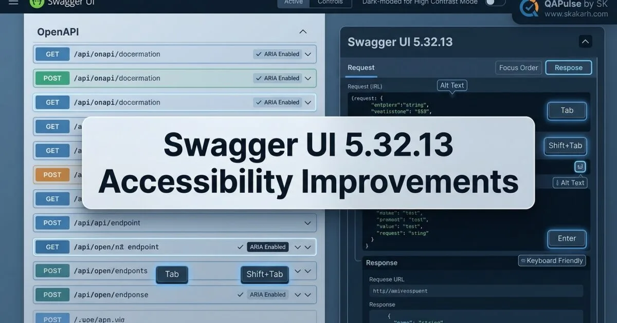
Swagger UI 5.32.13 is more than another patch-number update. Released on August 11, 2026, this version focuses heavily on accessibility, improving how important Swagger UI controls and navigation behave for keyboard users, assistive technologies, and high-contrast environments.
That makes this release particularly interesting because accessibility improvements are easy to underestimate. A button can look correct and still be unusable. A navigation element can exist visually while remaining invisible to a screen reader. A modal can work with a mouse while creating a frustrating keyboard experience.
Swagger UI 5.32.13 addresses several of these gaps through ARIA labels, landmarks, keyboard interactions, skip navigation, dark-mode control semantics, and Windows High Contrast Mode improvements.
For developers, API teams, testers, and documentation engineers, the bigger lesson is straightforward:
An API documentation interface is not truly complete when the API works. The interface itself must also be usable by everyone who needs to consume it.

What Changed in Swagger UI 5.32.13?
The 5.32.13 release is primarily a bug-fix release, but the concentration of accessibility fixes makes it more meaningful than a routine maintenance update.
The release includes improvements across:
- copy-to-clipboard controls
- skip-to-operations navigation
- page landmarks
- authorization dialogs
- dark-mode controls
- Windows High Contrast Mode
- accessible naming and state information
The individual changes may look small in a changelog.
Their combined effect is much larger.
A modern API documentation portal can contain dozens or even hundreds of interactive controls. If those controls are not correctly exposed to assistive technologies, users may struggle to understand or operate the API documentation.
ARIA Labels for Copy-to-Clipboard Buttons
One of the changes adds aria-label attributes to copy-to-clipboard buttons.
This matters because an icon alone may not provide sufficient accessible information.
Consider a simplified example:
<button>
  <svg>
    <!-- copy icon -->
  </svg>
</button>
A sighted user may immediately understand the button.
A screen reader user may not.
A more accessible implementation communicates the purpose explicitly:
<button aria-label="Copy API request">
  <svg aria-hidden="true">
    <!-- copy icon -->
  </svg>
</button>
Now the control has an accessible name.
This is a useful distinction:
| Implementation | Visual user | Assistive technology |
|---|---|---|
| Icon only | Usually understandable | Potentially ambiguous |
| Text label | Understandable | Understandable |
aria-label | Understandable | Explicit accessible name |
| Icon + accessible name | Strong | Strong |
The important lesson is that visual clarity and semantic clarity are not the same thing.
Skip-to-Operations Navigation
Another important change adds a skip-to-operations link along with banner and main landmarks.
This is particularly useful when a Swagger UI page contains a large amount of content before the actual API operations.
Imagine opening an API specification with:
Header
Navigation
Branding
Authentication
Description
Server information
Schemas
Tags
Operations
A keyboard user shouldn’t necessarily have to navigate through every element before reaching the API operations.
A skip link can provide a shortcut:
<a href="#operations" class="skip-link">
  Skip to operations
</a>

<main id="operations">
  ...
</main>
This is a small UI feature with a significant usability impact.


Why Landmarks Matter in Large API Documentation
Semantic landmarks help assistive technologies understand the structure of a page.
For example:
<header>
  ...
</header>

<main>
  ...
</main>

<footer>
  ...
</footer>
Instead of treating the entire page as an undifferentiated collection of HTML elements, assistive technologies can identify meaningful regions.
For a large API reference page, this becomes increasingly important.
Swagger UI isn’t simply displaying text.
It provides:
- navigation
- authentication
- API operations
- request controls
- response panels
- schemas
- interactive examples
- expandable sections
The more interactive the interface becomes, the more important semantic structure becomes.
Authorization Popup Gets Better Keyboard Behavior
Swagger UI 5.32.13 also improves the authorization popup so that it can be closed using:
Escape- backdrop click
The Escape behavior is particularly important for keyboard users.
A modal should not force the user to search visually for a close button.
A common interaction model is:
document.addEventListener("keydown", (event) => {
  if (event.key === "Escape") {
    closeAuthorizationDialog();
  }
});
Of course, production accessibility requires more than this single event handler.
A properly implemented dialog should also consider:
- focus management
- focus trapping
- accessible naming
- keyboard navigation
- restoration of focus
- appropriate dialog semantics
For example:
<div
  role="dialog"
  aria-modal="true"
  aria-labelledby="auth-title">

  <h2 id="auth-title">
    Available authorizations
  </h2>

  ...
</div>
This is where accessibility becomes an engineering discipline rather than a visual design preference.
Dark Mode Is Also an Accessibility Concern
The release adds accessible name and state information to the dark-mode toggle button.
Consider:
<button>
  🌙
</button>
Visually, the icon may be obvious.
Semantically, however, the control should communicate:
- what it does
- its current state
- what happens when activated
A stronger implementation could look conceptually like:
<button
  aria-label="Toggle dark mode"
  aria-pressed="false">
  🌙
</button>
Now assistive technology can understand both the control and its state.
This illustrates an important principle:
Interactive state should be communicated semantically, not only visually.
Windows High Contrast Mode Improvements
Several changes in Swagger UI 5.32.13 address Windows High Contrast Mode.
The release specifically includes fixes involving:
- icon visibility
- topbar logo visibility
- dark-mode toggle visibility
This is significant because accessibility is broader than screen readers.
A UI can be technically usable with a screen reader while still becoming difficult to use in high-contrast environments.
For example, an icon that depends on subtle color differences may effectively disappear when a high-contrast theme changes the rendering.
A useful testing matrix therefore includes:
| Environment | What to validate |
|---|---|
| Standard browser | Normal visual behavior |
| Keyboard only | Focus and navigation |
| Screen reader | Names and semantics |
| High Contrast Mode | Visibility |
| Zoom 200% | Layout |
| Reduced motion | Animation behavior |
| Dark mode | Contrast and state |
| Light mode | Contrast and state |
This is a much stronger accessibility strategy than simply asking:
“Does the page look accessible?”
Swagger UI 5.32.13 vs a Typical UI Patch
Not every patch release has the same practical impact.
Compare a hypothetical styling-only patch with this release:
| Area | Typical UI patch | Swagger UI 5.32.13 |
|---|---|---|
| Visual bugs | Possible | Yes |
| Accessibility | May be limited | Major focus |
| Keyboard behavior | May be unchanged | Improved |
| Screen readers | May be unchanged | Improved semantics |
| High Contrast Mode | Usually unchanged | Improved |
| Navigation | Usually unchanged | Skip navigation added |
| API behavior | Usually unchanged | Not the primary focus |
| Documentation usability | Moderate | Directly affected |
That is why release notes should not be evaluated only by counting features.
A release with six accessibility fixes can have more practical impact than a release containing twenty minor visual changes.
How to Test the Accessibility Changes
If you maintain Swagger UI as part of an internal API platform, don’t stop at:
npm test
You should test the actual interface.
A simple automated browser check could look like:
const copyButton = page.getByRole("button", {
  name: /copy/i
});

await expect(copyButton).toBeVisible();
You can also validate keyboard behavior:
await page.keyboard.press("Tab");
await page.keyboard.press("Escape");
And verify the dialog state:
await expect(
  page.getByRole("dialog")
).toBeHidden();
The exact selectors will depend on your application, but the testing principle is universal:
Test the semantic behavior, not just the visual rendering.
Accessibility Testing With Playwright
Swagger UI is a natural candidate for browser-based accessibility regression testing.
For example:
import { test, expect } from "@playwright/test";

test("authorization dialog can be closed with Escape", async ({ page }) => {
  await page.goto("/api-docs");

  await page.getByRole("button", {
    name: /authorize/i
  }).click();

  await expect(page.getByRole("dialog")).toBeVisible();

  await page.keyboard.press("Escape");

  await expect(page.getByRole("dialog")).toBeHidden();
});
This test does something more valuable than checking whether a CSS selector exists.
It verifies an actual user interaction.
You can similarly test accessible naming:
test("copy controls have accessible names", async ({ page }) => {
  await page.goto("/api-docs");

  const copyButtons = page.getByRole("button", {
    name: /copy/i
  });

  await expect(copyButtons.first()).toBeVisible();
});
This approach also makes tests more resilient than relying exclusively on implementation-specific selectors.
Automated Accessibility Checks
You can combine browser automation with an accessibility engine such as axe-core.
A conceptual Playwright test might look like:
import AxeBuilder from "@axe-core/playwright";

const results = await new AxeBuilder({
  page
}).analyze();

expect(results.violations).toEqual([]);
The important point is not that an automated scanner replaces accessibility testing.
It doesn’t.
Automated tools can identify many issues, but they cannot fully determine whether an interaction makes sense for every user.
A mature strategy combines:
Automated accessibility scan
          +
Keyboard testing
          +
Screen-reader testing
          +
High-contrast testing
          +
Visual regression
          +
Functional testing
That produces substantially stronger coverage.
What Developers Should Validate After Upgrading
If you’re upgrading to Swagger UI 5.32.13, create a focused regression suite around the areas changed by the release.
Copy Controls
Verify:
[ ] Copy button is visible
[ ] Accessible name exists
[ ] Keyboard can reach it
[ ] Activation copies expected content
[ ] Screen reader announces useful information
Skip Navigation
Verify:
[ ] Skip link exists
[ ] Keyboard can reach it
[ ] Activation moves focus correctly
[ ] Operations section receives focus
[ ] Visual focus indicator remains visible
Authorization Dialog
Verify:
[ ] Dialog has an accessible name
[ ] Escape closes it
[ ] Backdrop interaction works
[ ] Focus enters the dialog correctly
[ ] Focus returns appropriately
Dark Mode
Verify:
[ ] Toggle has an accessible name
[ ] Current state is exposed
[ ] Keyboard activation works
[ ] State changes correctly
[ ] Icon remains visible
High Contrast Mode
Verify:
[ ] Logo remains visible
[ ] Icons remain visible
[ ] Toggle remains visible
[ ] Focus indicators remain visible
[ ] Important information is not color-dependent
Should You Upgrade to Swagger UI 5.32.13?
The answer depends on how you use Swagger UI.
If Swagger UI is only used internally by developers, the risk may be relatively low.
If it is your public API documentation portal, the accessibility fixes become considerably more important.
Consider the difference:
| Usage | Upgrade priority |
|---|---|
| Local development only | Medium |
| Internal API documentation | Medium |
| Enterprise developer portal | High |
| Public API documentation | High |
| Accessibility-sensitive environment | Very high |
| Customer-facing API platform | High |
The release does not appear to require a major migration strategy based on the supplied changelog. Its changes are predominantly fixes and accessibility improvements.
That makes a controlled upgrade followed by UI regression testing a sensible approach.
The Bigger Lesson From Swagger UI 5.32.13
Swagger UI 5.32.13 demonstrates something that software teams sometimes overlook.
Accessibility is not a final polish step.
It is part of interface correctness.
A button that cannot be understood by assistive technology is not fully functional.
A navigation system that cannot be efficiently operated with a keyboard is not fully functional.
A dark-mode toggle that does not expose its state is not fully functional.
And an API documentation portal that works only for mouse users is not delivering the same experience to everyone.
The strongest engineering teams therefore treat accessibility requirements as testable behavior.
Requirement
    ↓
Implementation
    ↓
Semantic behavior
    ↓
Automated test
    ↓
Keyboard validation
    ↓
Assistive technology validation
    ↓
Release confidence
That is the real significance of this Swagger UI release.
It isn’t simply about adding a few ARIA attributes.
It is about making an already-interactive developer tool more understandable, navigable, and usable across different interaction methods.
Swagger UI 5.32.13: Accessibility Gets a Serious Upgrade
Swagger UI 5.32.13 is a small version bump with a surprisingly meaningful direction: the release puts accessibility directly into the developer experience. Instead of treating accessibility as a separate concern, this update improves how people navigate, understand, and interact with the API documentation interface.
That distinction matters because API documentation is not only read by developers sitting in ideal desktop environments. It can be consumed with keyboards, screen readers, high-contrast modes, different visual settings, and assistive technologies. A documentation interface that exposes an API correctly but cannot be navigated effectively is still creating friction.
The Swagger UI 5.32.13 release was published on August 11, 2026, and its listed changes are focused primarily on accessibility improvements. The release includes ARIA labels for copy buttons, a skip-to-operations link, semantic landmarks, improved authorization-dialog behavior, better naming and state information for the dark-mode toggle, and fixes for Windows High Contrast Mode.
That makes this release interesting beyond Swagger UI itself: it demonstrates how seemingly small interface changes can improve the usability and testability of an entire developer-facing product.
What Changed in Swagger UI 5.32.13?
The release is primarily a bug-fix and accessibility release rather than a major feature release.
The notable changes include:
| Area | Change | Why it matters |
|---|---|---|
| Copy buttons | Added aria-label attributes | Screen-reader users can understand button purpose |
| Navigation | Added skip-to-operations link | Keyboard users can bypass repetitive content |
| Semantics | Added banner and main landmarks | Improves page structure for assistive technology |
| Authorization | Escape and backdrop click now close the popup | Improves keyboard and interaction behavior |
| Dark mode | Toggle receives name and state | Assistive technologies can understand its function |
| High Contrast Mode | Icons and controls remain visible | Improves Windows accessibility |
| Top bar | Logo and dark-mode toggle remain visible in HCM | Prevents important controls from disappearing |
The important lesson is that these changes are not cosmetic.
They improve the relationship between the visual interface, keyboard interaction, and accessibility tree.


Why Accessibility Improvements Matter More Than They Look
Consider a typical Swagger UI page.
A developer sees something like:
GET /users/{id}

Try it out

Execute

Response
Visually, the purpose of each control may be obvious.
But a screen reader does not simply interpret the page the same way a sighted user does. It relies heavily on semantic HTML, accessible names, roles, states, and relationships.
For example, this button is technically clickable:
<button>
  📋
</button>
But what does the button do?
A sighted user might infer that the clipboard icon means “copy.”
A screen-reader user may receive little or no useful information.
A better implementation is:
<button aria-label="Copy request URL">
  📋
</button>
Now the control has an accessible name.
That is exactly why the copy-to-clipboard accessibility improvement in Swagger UI 5.32.13 is more significant than the size of the code change suggests.
The Strategic Difference Between Visual Testing and Accessible Testing
This release also highlights an important testing distinction.
A conventional UI test might check:
await expect(copyButton).toBeVisible();
await copyButton.click();
That verifies visual presence and interaction.
But accessibility-aware testing asks additional questions:
await expect(copyButton).toHaveAttribute(
  'aria-label',
  /copy/i
);
And potentially:
await expect(copyButton).toBeEnabled();
The difference is subtle but important.
| Traditional UI validation | Accessibility-aware validation |
|---|---|
| Is the button visible? | Does the button have an accessible name? |
| Can it be clicked? | Can it be operated using a keyboard? |
| Does the click work? | Can assistive technology understand its purpose? |
| Does the popup open? | Can users identify and close the popup accessibly? |
| Is dark mode visible? | Does the toggle expose its current state? |
The strongest teams don’t replace one approach with the other.
They combine them.
Swagger UI 5.32.13 and the Copy-to-Clipboard Problem
Copy buttons are a perfect example of why accessibility needs to be tested at the semantic level.
Suppose Swagger UI renders an operation like:
GET /orders/{orderId}

[ Copy ]

[ Try it out ]
A basic automation test could locate the copy button through CSS:
await page.locator('.copy-button').click();
That works until the implementation changes.
A more resilient test can use the accessible contract:
await page.getByRole('button', {
  name: /copy/i
}).click();
This approach has two advantages.
First, it tests the way a user-facing control is actually exposed.
Second, it makes the test more resilient to implementation-level CSS changes.
This is an important automation principle:
Prefer testing user-facing semantics over implementation-specific selectors whenever the semantic contract is stable.
That principle applies equally to Swagger UI, React applications, Angular applications, and modern component libraries.
Skip Links Are Small Features With Large UX Impact
One of the more interesting changes in Swagger UI 5.32.13 is the addition of a skip-to-operations link.
Imagine an API documentation page containing:
- header navigation
- branding
- theme controls
- authentication controls
- server selection
- introductory content
- dozens of API operations
A keyboard user may have to move through a significant amount of content before reaching the actual API operations.
A skip link provides a shortcut:
<a href="#operations">
  Skip to operations
</a>
with a target such as:
<main id="operations">
  ...
</main>
This is not about making the page prettier.
It reduces unnecessary keyboard navigation.
From a testing perspective, that creates a new testable behavior:
const skipLink = page.getByRole('link', {
  name: /skip to operations/i
});

await expect(skipLink).toBeVisible();
You can go further and verify its destination:
await expect(skipLink).toHaveAttribute(
  'href',
  '#operations'
);
The exact implementation may differ, but the testing principle remains the same: verify the accessibility behavior, not merely the existence of an element.


Why Semantic Landmarks Matter in API Documentation
The release also adds banner and main landmarks.
This is particularly useful for large API documentation pages.
A simplified structure might look like:
<header role="banner">
  ...
</header>

<main>
  ...
</main>
These landmarks give assistive technologies meaningful regions to navigate.
Compare two approaches.
Weak structure:
<div class="header">
  ...
</div>

<div class="content">
  ...
</div>
Semantic structure:
<header>
  ...
</header>

<main>
  ...
</main>
The second approach communicates intent.
This is similar to the difference between selecting elements by:
.header
and interacting with:
page.getByRole('banner')
The latter is based on semantics rather than styling.
Authorization Popup Behavior Is Also a Testability Improvement
Another change in Swagger UI 5.32.13 affects the authorization popup.
The popup can now be closed using:
Escape- backdrop click
This sounds simple, but modal behavior is an important accessibility and usability concern.
A good automated test should therefore cover multiple interaction paths.
For example:
await page.getByRole('button', {
  name: /authorize/i
}).click();

await page.keyboard.press('Escape');

await expect(
  page.getByRole('dialog')
).not.toBeVisible();
You can separately validate backdrop behavior where the implementation exposes a reliable interaction target.
The strategic lesson is important:
A modal should not have only one happy-path interaction.
If a user can open a dialog, the test strategy should consider how that user can exit it.
Swagger UI vs. Generic UI Testing
This release is also a useful opportunity to compare API documentation testing with ordinary web UI testing.
| Testing approach | What it catches |
|---|---|
| Screenshot testing | Visual regressions |
| Functional UI testing | Broken interactions |
| API testing | Endpoint behavior |
| Accessibility testing | Semantic and interaction barriers |
| Keyboard testing | Navigation and focus problems |
| Cross-browser testing | Browser-specific behavior |
| High Contrast testing | Visibility problems in accessibility modes |
A mature Swagger UI test strategy therefore should not stop at:
expect(statusCode).toBe(200);
or:
await expect(page).toHaveScreenshot();
It should also ask:
Can the user find the operation?
Can the user navigate to it?
Can the user understand the controls?
Can the user operate them without a mouse?
Can assistive technology identify their purpose?
Can dialogs be closed predictably?
Do important controls remain visible in accessibility modes?
These questions transform accessibility from a compliance checkbox into an engineering quality dimension.
Testing Swagger UI 5.32.13 With Playwright
Playwright is particularly useful for validating the user-facing behavior introduced in this release.
A basic test could look like:
import { test, expect } from '@playwright/test';

test('Swagger UI exposes accessible copy controls', async ({ page }) => {
  await page.goto('/api-docs');

  const copyButton = page.getByRole('button', {
    name: /copy/i
  });

  await expect(copyButton.first()).toBeVisible();
});
You can extend the test:
test('Swagger UI supports keyboard navigation', async ({ page }) => {
  await page.goto('/api-docs');

  await page.keyboard.press('Tab');

  await expect(
    page.getByRole('link', {
      name: /skip to operations/i
    })
  ).toBeFocused();
});
The exact focus order depends on the rendered application and configuration, so the important thing is not to blindly assert a specific tab sequence.
Instead, test the accessibility contract your application actually promises.
Where Axe Fits Into the Strategy
Automated accessibility scanners such as axe can complement functional tests.
For example:
import AxeBuilder from '@axe-core/playwright';

test('Swagger UI has no critical accessibility violations', async ({ page }) => {
  await page.goto('/api-docs');

  const results = await new AxeBuilder({
    page
  }).analyze();

  expect(results.violations).toEqual([]);
});
But there is an important warning.
An accessibility scanner is not an accessibility strategy.
Automated tools can identify many classes of problems, but they cannot fully determine whether the interface is understandable or whether the keyboard experience is genuinely usable.
Think of the layers like this:
          Accessibility quality
                  │
       ┌──────────┴──────────┐
       │                     │
 Automated checks      Human evaluation
       │                     │
 axe / ARIA / DOM      keyboard / screen reader
       │                     │
       └──────────┬──────────┘
                  │
           Functional tests
                  │
           Visual regression
Each layer catches a different class of problem.
High Contrast Mode Deserves Its Own Test Thinking
The Windows High Contrast Mode fixes are especially interesting because conventional screenshots may not detect every accessibility problem.
A control can technically exist in the DOM:
await expect(toggle).toBeVisible();
while still being difficult or impossible to distinguish visually under a high-contrast configuration.
That means teams should think beyond default browser rendering.
A stronger compatibility matrix might include:
| Environment | Validation |
|---|---|
| Chrome | Functional + accessibility |
| Firefox | Functional + accessibility |
| Edge | Functional + accessibility |
| Keyboard-only | Navigation + focus |
| Screen reader | Names + roles + states |
| High Contrast Mode | Visibility + controls |
| Dark mode | Contrast + state |
| Mobile viewport | Layout + interaction |
This is where Swagger UI 5.32.13 becomes more than a release-note story.
It becomes a reminder that the “normal” browser configuration is only one possible user environment.
The Dark-Mode Toggle Is a Good Example of State Testing
The release also improves the naming and state of the dark-mode toggle.
That distinction is important.
A button can have a name:
Dark mode
but the user may also need to know whether dark mode is currently active.
Accessibility states can communicate this.
For example:
<button
  aria-label="Dark mode"
  aria-pressed="true">
</button>
Now automation can validate both identity and state:
const themeButton = page.getByRole('button', {
  name: /dark mode/i
});

await expect(themeButton).toHaveAttribute(
  'aria-pressed',
  'true'
);
The exact accessible state exposed by the implementation should be verified rather than assumed, but the principle is universal:
If a control changes state, test the state—not only the click.
Swagger UI 5.32.13 Compared With Other API Documentation Tools
It is tempting to evaluate API documentation tools only by how they render OpenAPI specifications.
That is incomplete.
A more useful comparison includes accessibility and automation characteristics.
| Capability | Swagger UI | Redoc | Custom API portal |
|---|---|---|---|
| OpenAPI rendering | Strong | Strong | Depends on implementation |
| Interactive API calls | Strong | More limited by setup | Depends |
| Accessibility responsibility | Shared with project | Shared with project | Primarily project-owned |
| Customization | High | High | Very high |
| Accessibility testing | Must be validated | Must be validated | Must be engineered |
| Automation integration | Excellent with browser tools | Excellent with browser tools | Depends on implementation |
The key point is not that one tool automatically “wins.”
The quality of the final API documentation experience depends heavily on how the interface is configured, integrated, and tested.
A Practical Regression Suite for Swagger UI
If you are upgrading to Swagger UI 5.32.13, don’t limit regression testing to “the API documentation page opens.”
Build a focused suite.
Swagger UI regression
│
├── Rendering
│   ├── OpenAPI loads
│   ├── Operations appear
│   └── Schemas render
│
├── Interaction
│   ├── Try it out
│   ├── Execute
│   ├── Copy
│   └── Authorization
│
├── Accessibility
│   ├── Accessible names
│   ├── Landmarks
│   ├── Skip navigation
│   ├── Keyboard operation
│   └── Dialog behavior
│
├── Visual
│   ├── Light mode
│   ├── Dark mode
│   └── High contrast
│
└── Compatibility
    ├── Chrome
    ├── Firefox
    └── Edge
This is a much stronger strategy than creating hundreds of brittle selector-based tests.
Upgrade or Wait?
For a patch-level release primarily focused on bug fixes and accessibility improvements, the upgrade decision should be based on your integration risk rather than the version number alone.
If your application:
- embeds Swagger UI directly,
- depends heavily on API documentation,
- has accessibility requirements,
- supports keyboard navigation,
- has users working with assistive technology,
- or has previously encountered accessibility regressions,
then the changes in Swagger UI 5.32.13 are worth validating promptly.
Before upgrading production, run at least:
npm test
followed by your browser regression suite:
npx playwright test
and accessibility checks:
npx playwright test tests/accessibility
The objective should not be:
“Did Swagger UI install successfully?”
The better question is:
“Does our API documentation still provide the same functional, accessible, and predictable experience after the upgrade?”
That is the difference between dependency management and engineering validation.
A Better Mental Model for Small Releases
Small releases are often underestimated because their version numbers don’t look dramatic.
But a patch can affect:
- DOM structure
- ARIA attributes
- focus behavior
- selectors
- keyboard interactions
- visual states
- accessibility scanners
- browser automation
- custom CSS
- custom JavaScript
- snapshot tests
Therefore, a good upgrade strategy is:
Release notes
     ↓
Identify changed behavior
     ↓
Map behavior to dependencies
     ↓
Create targeted regression tests
     ↓
Run accessibility validation
     ↓
Run browser matrix
     ↓
Review visual differences
     ↓
Deploy progressively
That process is reusable for Swagger UI and practically every frontend dependency your engineering team maintains.
Interactive Challenge: Find the Hidden Regression
Take one Swagger UI page in your own project and answer these questions:
- Can you reach the API operations using only a keyboard?
- Can you identify the copy button without seeing its icon?
- Can you close the authorization dialog with
Escape? - Can a screen reader distinguish the major page regions?
- Can you determine whether dark mode is enabled?
- Do important controls remain visible in high-contrast environments?
- Can your automated tests validate these behaviors without relying on CSS classes?
If you answered “no” to several questions, the problem isn’t necessarily your test framework.
Your test strategy may simply be validating the wrong contract.
The most valuable lesson from Swagger UI 5.32.13 is therefore not one particular ARIA attribute or keyboard shortcut.
It is the shift from testing what the interface looks like toward testing how the interface communicates and behaves.


Why This Release Matters for Modern Engineering Teams
Accessibility improvements are increasingly becoming part of engineering quality rather than a final-stage compliance exercise.
For teams building developer portals, API documentation, internal platforms, and AI-assisted development tools, that matters even more.
Developers are users too.
An API documentation portal is effectively a product interface. It has navigation, controls, dialogs, state changes, keyboard behavior, visual themes, and content hierarchy.
That means it deserves the same engineering discipline as any other production UI.
Swagger UI 5.32.13 provides a useful example of that philosophy: a release containing relatively focused changes can still improve the fundamental usability of a product.
And for automation engineers, it provides another opportunity to evolve testing beyond:
expect(element).toBeVisible();
toward:
expect(element).toBe
  .namedCorrectly()
  .keyboardAccessible()
  .stateAware()
  .functionallyCorrect();
The syntax may differ, but the engineering mindset is the important part.
Internal Links
- Learn MCP – Zero to Hero
- Learn AI Agents for QA – Zero to Hero
- Playwright Automation – Zero to Hero
- TencentDB Agent Memory: Complete Zero to Hero
- LangGraph: Complete Zero to Hero
- Learn Python – Zero to Hero
- OpenAI Codex: Complete Zero to Hero
- Cursor AI: Complete Zero to Hero
- Claude Code Tutorial: Complete Zero to Hero
- AutoGen: Complete Zero to Hero Guide
- Free QA Resources Built From Real Experience
- QA Glossary: Test Automation Terms Every Engineer Should Know
External Links
- Swagger UI official documentation: Swagger UI Documentation
- Swagger UI GitHub repository: Swagger UI GitHub Repository
- Swagger UI v5.32.13 release: Swagger UI v5.32.13 Release
- OpenAPI Specification: OpenAPI Specification
- Swagger Editor: Swagger Editor
- Swagger Parser: Swagger Parser GitHub Repository
- Web Content Accessibility Guidelines (WCAG): W3C WCAG Overview
- ARIA Authoring Practices Guide: WAI-ARIA Authoring Practices Guide
AI Overview / Answer Engine Optimization
What is Swagger UI 5.32.13?
Swagger UI 5.32.13 is a release of Swagger UI focused primarily on accessibility fixes and improvements, including accessible copy buttons, skip-to-operations navigation, semantic landmarks, improved authorization dialog behavior, better dark-mode control semantics, and High Contrast Mode fixes.
What are the main changes in Swagger UI 5.32.13?
The main changes include:
- ARIA labels for copy-to-clipboard buttons.
- A skip-to-operations link.
- Banner and main landmarks.
- Improved authorization popup dismissal.
- Better naming and state for the dark-mode toggle.
- Improved Windows High Contrast Mode visibility.
- Better visibility of important top-bar controls in High Contrast Mode.
Should you upgrade to Swagger UI 5.32.13?
Teams using Swagger UI should consider upgrading after running targeted regression and accessibility tests, particularly when API documentation is an important user-facing application or accessibility is a product requirement.
How should Swagger UI 5.32.13 be tested?
Test functional interactions, accessible names and roles, keyboard navigation, authorization dialogs, dark-mode state, High Contrast Mode, browser compatibility, and visual behavior. Playwright and automated accessibility tools can be combined for broader coverage.
People Asked Questions
What is new in Swagger UI 5.32.13?
Swagger UI 5.32.13 focuses primarily on accessibility improvements, including ARIA labels, skip navigation, semantic landmarks, improved authorization popup behavior, dark-mode state information, and High Contrast Mode fixes.
Is Swagger UI 5.32.13 an accessibility-focused release?
Yes. A significant portion of the listed changes in Swagger UI 5.32.13 addresses accessibility and interaction behavior.
Should I upgrade to Swagger UI 5.32.13?
If your project uses Swagger UI, upgrading is worth considering, followed by targeted regression testing. Accessibility-sensitive applications should specifically validate keyboard navigation, dialogs, controls, themes, and High Contrast Mode.
What should I test after upgrading Swagger UI?
Test API rendering, Try It Out, Execute, copy controls, authorization, keyboard navigation, skip links, accessible names, dialogs, dark mode, High Contrast Mode, and browser compatibility.
Does Swagger UI 5.32.13 improve keyboard accessibility?
Yes. The release adds a skip-to-operations link and improves interaction behavior such as closing the authorization popup with Escape.
What changed for Swagger UI copy buttons?
The release adds ARIA labels to copy-to-clipboard buttons, making their purpose more understandable to assistive technologies.
Does Swagger UI 5.32.13 improve dark-mode accessibility?
Yes. The dark-mode toggle receives improved accessible naming and state information.
Does Swagger UI 5.32.13 fix High Contrast Mode issues?
Yes. The release includes fixes intended to keep icons, the logo, and the dark-mode control visible in Windows High Contrast Mode.
Can Playwright test Swagger UI accessibility?
Yes. Playwright can test accessible roles, names, keyboard interactions, focus behavior, dialogs, and other user-facing accessibility contracts. It can also be combined with automated accessibility scanners.
Is an accessibility scanner enough to test Swagger UI?
No. Automated scanners are useful but cannot replace keyboard testing, functional testing, visual validation, and human evaluation with assistive technologies.
Conclusion
Swagger UI 5.32.13 may look like a small maintenance release, but its accessibility-focused changes reveal something much bigger about modern web engineering. Improvements to accessible names, keyboard navigation, semantic landmarks, dialog behavior, theme controls, and High Contrast Mode can directly change how users experience API documentation.
The important lesson is not simply to upgrade Swagger UI 5.32.13. It is to change how we validate dependency upgrades.
Don’t test only whether the documentation loads. Test whether users can navigate it, understand it, operate it, and recover from interactions across different environments.
For engineering teams, the strongest approach combines functional testing, accessibility assertions, keyboard testing, visual validation, browser compatibility checks, and targeted regression coverage.
A small release can change the interface contract your tests depend on. Your regression strategy should therefore be based on user-facing behavior, not simply version numbers or CSS selectors.
Final Key Takeaways
- Swagger UI 5.32.13 focuses heavily on accessibility and usability improvements.
- Copy-to-clipboard controls now receive accessible names through ARIA improvements.
- Skip-to-operations navigation helps keyboard users reach API content faster.
- Semantic landmarks make large API documentation pages easier for assistive technologies to navigate.
- Authorization dialogs now support additional closing interactions such as
Escapeand backdrop clicks. - Dark-mode controls expose better naming and state information.
- Windows High Contrast Mode receives important visibility improvements.
- Accessibility testing should go beyond checking whether an element is visible.
- Prefer semantic selectors such as
getByRole()when they represent the application’s user-facing contract. - Playwright and axe can complement each other, but automated accessibility scanning cannot replace meaningful keyboard and assistive-technology testing.
- API documentation should be treated as a real product interface, not merely generated documentation.
- The best regression strategy validates functionality + accessibility + interaction + visual behavior + browser compatibility.
- Before production deployment, test the behaviors affected by the release rather than assuming a patch release is risk-free.
The real upgrade question is not “Does Swagger UI 5.32.13 work?”
It is:
“Can every user still understand, navigate, and use our API documentation after the upgrade?”
Continue Learning
Explore more expert articles on Mobile Testing, Backend & API, AI & Agentic, AI Tools, n8n, LangChain, CrewAI, MCP Servers, AI Agents, LlamaIndex, Docker, FastAPI, Playwright, Cypress, Test Automation, DevOps, and Software Engineering at www.skakarh.com.
QAPulse by SK delivers expert release analysis, AI engineering insights, enterprise automation strategies, migration guidance, DevOps best practices, and practical testing knowledge to help software professionals build scalable, intelligent, and production-ready software systems.